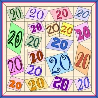
Any way you write it, twenty years of EQ is impressive.
High fun! First I drew a block segmented into 20 squares or rectangles. I converted this block to a quilt layout. Then I popped EQ’s block “Twist 5 Frame” in the main block spaces. Finally, I parked a “20″ in different fonts into each tilty-looking block. The hard part here is to stop choosing different fonts!
Fonts used are COLUMN 1: Baskerville Old Face; JL-Dewool; Castellar; and Cooper Black. COLUMN 2: Bell MT; Bodoni MT Black; Arial; Goudy Stout; Kristin ITC; and Elephant. COLUMN 3: JL-Bromid; JL-Gewgaw / High Tower Text; JL-Pigeon; Curlz MT; and JL-Nearly. COLUMN 4: Edwardian Script ITC; JL-Kinins; Broadway; and JL-Exequy.
Did I mention that I love to use different and sometimes unusual fonts? I do make myself use the old standard Times New Roman in my family letters once a year just so it won’t feel ignored.
Sunnyside, Washington


Leave a comment!
By submitting a comment you grant DoYouEQ.com a perpetual license to reproduce your words and name/web site in attribution. Inappropriate and irrelevant comments will be removed at an admin’s discretion. Your email is used for verification purposes only, it will never be shared.