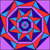
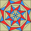
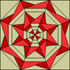
by Andrea Bishop
Welcome to the club! If you have EQ software and the Kaleidoscope Collection add-on installed, you’ll be able to follow along.
This is the seventh of twelve Kaleidoscope lessons.
Intro
Knowing some basic principles of Color Theory can help you create the perfect look in your next quilt. We’ll practice figuring out ‘what is important‘ in the design and ‘making it important‘ via color. Whether you use the Red-Yellow-Blue Color Wheel (what we learned in Elementary School) or Magenta-Yellow-Cyan Color Wheel (what graphic designers use)… the concepts are the same.
In this lesson, I’m going to have a project available for you to download so we can get right to the blocks and coloring after the basics. It has all the shades, tints and tones started for you.
Download the Project
- Download the project and pen the file.
- Then from within EQ, choose FILE > Save As and save the file in your project folder: My Documents > My EQ7 > PJ7
You don’t need to follow these directions. These steps are just for the curious.
- I started a new project.
- View Sketchbook button and deleted out all the fabrics and colors (except black and white). I used the “focus” trick by deleting the first one and then holding down the ENTER key.
- Closed the Sketchbook.
- On the Quilt Worktable, clicked the Paintbrush tool to see the palette.
- In the palette, clicked the Solids/Colors tab.
- Right-clicked Black and chose Add Grades.
- In the top-right drop-down, chose white. This made all the shades of gray.
- Then added the first color to the palette.
- Add Grades with White, Black, and the 5th Gray using this new color
- Then added the next color to the palette.
- Add Grades with White, Black and the 5th Gray using the next new color.
- Then I repeated steps 10 and 11 for the colors I wanted in the palette: red, red-orange, orange, yellow-orange, yellow, yellow-green, green…
For more information on Add Color**, Add Shades & Tints, Add Tones and Add Grades search in the EQ7 User Manual (available in under Help in your EQ7.)
**When using this technique make sure you click the first empty white box in the top-left of Custom Colors before defining the RGB or HSL numbers, then click the Add to Custom Colors button. Click OK if you’re only adding one color. If you’re adding more colors, click the next box to the right in Custom Colors… if you fill the first row, go down to the bottom-left white box. Each time a color is added, there will be a white swatch at the end. I went in to the Sketchbook and deleted the extra whites before adding grades of everything.
Understanding the Basics
Look at the next 4 sections before starting on the blocks. You’ll learn about tints, shades, and tones, and then the rules.
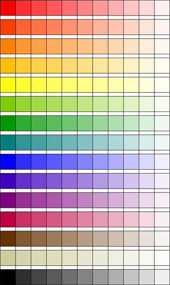
Lighter Values – Tints – Mixing with White
In EQ, you can use the Add Shades and Tints feature or Add Grades and mix your selected color with white. On a predominantly light block, you can make a color less important by lightening it. On a predominantly dark block, you can make a color more important by lightening it.
The colors in the left column are pretty pure. Mixing them with white leads to lighter, tinted versions, but still kind of pure. The brown and the tan show that you can do lighter values of any color… not just the main colors of the color wheel.
Mixing with White
Keep in mind there are many values possible for each color… not just the one listed above.
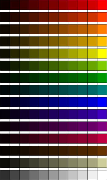
Darker Values – Shades – Mixing with Black
In EQ, you can use the Add Shades and Tints feature or Add Grades and mix your selected color with black. On a predominantly light block, you can make a color more important by darkening it. On a predominantly dark block, you can make a color less important by darkening it.
The colors in the left column are pretty pure. Mixing them with black leads to darker, shaded versions, but still kind of pure. The brown and the tan show that you can do darker values of any color… not just the main colors of the color wheel.
Mixing with Black
Keep in mind there are many values possible for each color… not just the one listed above.
Tones – Mixing with Gray
In EQ, you can use the Add Tones feature or Add Grades and mix your selected color with gray. You can make a color less important by graying it out.
The colors in the left column are pretty pure. Mixing them with gray leads to subdued, toned versions that are not as pure. The brown and the tan show that you can do tones of any color… not just the main colors of the color wheel.
Mixing with Gray
Keep in mind there are many tones possible for each color… not just the one listed above.
Understanding the Color Game
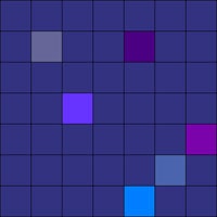
Everything leads to yellow. Yellow is the game-ender. It stands out the most out of all the colors. Anything close to yellow on the color wheel will have the same effect.
The color relationships are interwoven, so many times a color’s effectiveness is changed by these rules, the colors you pair it with, and how much of those colors are in the grouping.
Blocks from the Library
- Click LIBRARIES > Block Library.
- Go to Kaleidoscope Collection > Square Corners > 02 Compasses.

- Click on the 8th block Spinnaker 2 and click Add to Sketchbook.
- Click on the 6th block Dignity 2 and click Add to Sketchbook.
- Go to Square Corners > 06 Pinwheels.
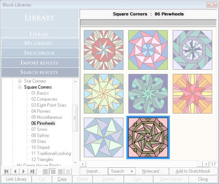
- Click on the 3rd block from the end Pointed Path 2 and click Add to Sketchbook.
- Go to Square Corners > 07 Snow.

- Click on the 12th block Catamaran 2 and click Add to Sketchbook.
- Click Close to put the library away.
Start a new Quilt
- Click WORKTABLE > Work on Quilt.
- Click QUILT > New Quilt > Horizontal.
- Click the Layout tab at the bottom-left corner of your screen.
- Set the number of blocks to be horizontal: 5 and vertical: 4.
- Set the finished size of blocks to be 9.
- Set the finished size of sashing to be 1.
- Click the Layer 1 tab.
Set the Blocks in the Quilt
- Click on the Set Block tool
 . The Sketchbook Blocks palette appears.
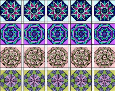
 - Click the first block and click in all 5 spaces across the first row. (Leave the sashing empty.)
- Click the second block and fill the next row.
- Fill the third row with the third block and fill the fourth row with the fourth block.
Figuring Out What’s Important in the Design
- Click the
 Spraycan tool, so the palette appears.
 - Inside the palette, click the Solids or Colors tab.
- Find yellow and click to select it.
- Don’t touch the first column.
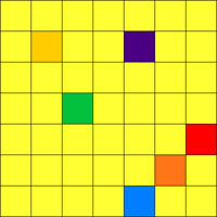
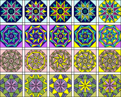
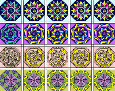
- For each block across, click on a different part of the block/different color. (For the snowflake in the center of the last block, you can color the lavender and purple together as one.) Try to make yours match this picture, so that when we analyze it we’re talking about the same thing.
Analyzing What We’ve Done
If it looks stupid when it’s accented, then you know not to do that with your real colors.
Row #1 - for the second block where the turquoise star points and turquoise center pinwheel were switched to yellow, you can see that these are indeed important parts of the block and the block looks better when they are accented. Everything else is less important or distracting. A good runner-up is block is block #3… you could make that the second-most important color.
Row #2 - for the second block where the front turquoise star points were switched to yellow, you can see that these are important and look good accented. Everything else is less important or distracting. A good runner up is the outline in block #4.
Row #3 - for the second block where dark olive was switched to yellow, you can see there are 3 important sections to this block (the squares in the outer section, the outline, and the star points). Everything else is less important or distracting. A good runner up is block #3.
Row #4 - for this row, it’s more about your preference. The second block is great if you want to accent complexity of the outline. The third block is great if you want it to look kind of like a flower. The fourth block is great if you want to make it more like a snowflake or draw the eye to the center. The last block is distracting, so I wouldn’t choose that one.
Recoloring the Originals to Make the Important Parts Stand Out
Now we’re going to clean up the quilt and work our way across the quilt to our new emphasized colorings.
- Click on the Set Block tool
 . The Sketchbook Blocks palette appears.
 - Don’t touch column one or two. Click the original coloring of each block in columns 3, 4, and 5. It should look like this now:
- Click the
 Spraycan tool, so the palette appears.
 - Inside the palette, click the Solids or Colors tab.
- Find yellow and click to select it.
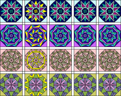
- Don’t touch column one or two. Make the blocks in columns 3, 4 and 5 match column two by clicking with the Spraycan on the same part that is colored yellow. It should look like this now:
Let’s work on Row 1
Let’s work on Row 2
Let’s work on Row 3
Last Row! – #4
Review
Look at the original blocks in column 1. Compare them to column 5. Better? Worse?
You can put a lot of thought into color, sometimes the serendipitous color schemes are great too. Just remember the rules and how to tweak a color if it isn’t working for you in your block.
Homework – Build your own Fabric Version
Using the same project you have open, try building a fabric version of this palette. You can use the fabrics from EQ, Stash, the fabrics of the month, images from manufacturers websites, or even your own scans. For each color, find a super-dark, dark, pure, lighter, super-light, dark toned, and light toned fabric. That’s 7 fabrics for each one. Example: here’s what I found for red and purple:
OPTIONAL MYSTERY SIDE PROJECT – SEWING INVOLVED
MONTH 6 of Sewing Project
Remember, throughout this whole process there is to be NO PEEKING with the previous work! Hide the block out of sight until next month. I’m going to reveal the project next month, so you don’t have to wait much longer!
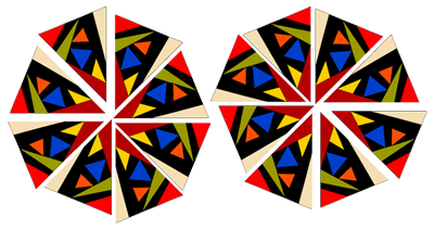
This month I want you to make 2 blocks (16 loose wedges). One set of 8 will be regular. The other set of 8 will be mirrored.
Pick any Star-Cornered Block that looks fun and that isn’t symmetrical within its own wedges.
Go to LIBRARIES > Block Library > Kaleidoscope Collection > Star Corners > any category.
Click your block and Add it to the Sketchbook.
Close the Library.
View the Sketchbook > Blocks section.
Edit your block
Print the first 8 wedges
Choose FILE > Print > Foundation Pattern.
Go to the Sections tab.
Click the Start Over button.
Click on all the pieces of one wedge EXCEPT FOR THE STAR CORNER.
Click the Group button.
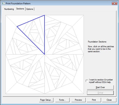
Click the star corner and click Group.
Go to the Options tab.
Make your block size 15.00 by 15.00.
Set the number of copies to 8.
Make sure the options are as follows:
Print numbering CHECKED.
Print as many as fit unchecked.
Separate units CHECKED.
Make sure Mirror is unchecked.
Grayscale – personal preference I like it CHECKED.
Print block name CHECKED.

Click Preview.
Click the Delete button at the top of your screen.
Click on the corner you grouped and press your keyboard DELETE key.
What remains is the wedge minus the corner.
Click the Move button at the top of your screen.
Drag the section to fit cleanly on one page with no tiling onto the next page.
Click Print at the top of your screen.
8 copies of this wedge will come out.
Print the last 8 wedges
Choose FILE > Print > Foundation Pattern.
Go to the Options tab.
Make your block size 15.00 by 15.00.
Set the number of copies to 8.
Make sure the options are as follows:
Print numbering CHECKED.
Print as many as fit unchecked.
Separate units CHECKED.
Make sure Mirror is CHECKED.
Grayscale – personal preference I like it CHECKED.
Print block name CHECKED.

Click Preview.
Click the Delete button at the top of your screen.
Click on the corner you grouped and press your keyboard DELETE key.
What remains is the wedge minus the corner.
Click the Move button at the top of your screen.
Drag the section to fit cleanly on one page with no tiling onto the next page.
Click Print at the top of your screen.
8 copies of this wedge will come out.
Feel free to go to the Color tab and test out some color placement to see how to make the fabrics you’ve chosen really pop in the block. I recommend keeping the blocks the same color. Foundation Piece all 16 wedges, but do notsew the wedges together. You’ll have something like what you see below.
Put all 16 loose wedges in a bag or a box and label it so you know what’s inside. Keep them with Months 1-5 somewhere you can find them all again, but not so you can look at them until next month when we reveal the project.
Remember
This quilt can get busy really fast. Use your background, black, or white to rest the eye and tie the blocks together color-wise.
I want a picture next month! I think it will be so fun to see everyone’s works-in-progress and then show the updated/finished quilts or quilt tops this fall.
Next month has a lot of cutting. I used Freezer Paper for those pieces and you would not believe how much it helped. I used about 20 sheets that were pre-cut to 8.5″ x 11″ so I could feed them through my inkjet printer. (I actually used 22, because I goofed up the first 2 printouts.)

